What Makes a Booth Stand Out in a Crowded Exhibition Hall
Key Takeaways
- Clear messaging and visual hierarchy help visitors understand a booth’s purpose within seconds
- Layouts that follow natural foot flow encourage longer visits and easier conversations
- Layered lighting and durable materials quietly signal quality and preparedness
- Consistency across design, staff presence, and materials builds trust and recognition
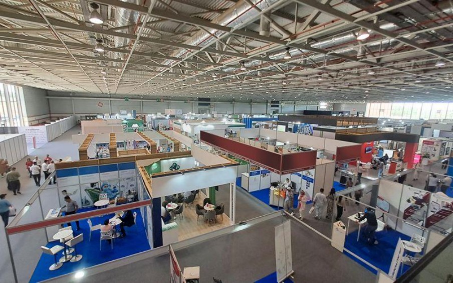
Exhibition halls feel busy, loud, and visually demanding. Visitors move quickly, scan widely, and decide within moments whether a booth feels worth a pause. A standout presence rarely comes from flashy tricks. It usually comes from clear planning, thoughtful choices, and a focus on how people behave on the show floor. When the basics work together, attention follows without forcing it.
Clarity Before Creativity
A booth earns interest when visitors understand its purpose without effort. Clear messaging, readable graphics, and logical placement of key elements help people grasp what a brand offers while walking past at a steady pace. Studies on visual perception show that simple layouts reduce mental load, which helps engagement feel natural in crowded environments.
Strong exhibition booth design starts with hierarchy. One main message, one focal point, and supporting details placed where eyes naturally travel create order in visual noise. Large text, consistent colours, and familiar shapes help visitors recognise intent quickly. Playful touches still fit, yet they work best after clarity does its job. A clever pun lands better once visitors already know what a booth represents.
Layouts That Respect Visitor Movement
Crowded halls create natural traffic patterns. Booths that fight foot flow feel awkward, while booths that follow it feel welcoming. Open corners, wide entry points, and clear walkways encourage people to step inside without hesitation.
Practical exhibition booth set-up decisions often determine whether visitors linger or leave. Cable placement, furniture spacing, and storage access affect comfort even when visitors never consciously notice them. Event organisers publish floor behaviour guidelines showing that open layouts encourage longer dwell time and smoother circulation. When staff can move easily and visitors can step aside to chat, conversations feel relaxed instead of rushed.
Lighting That Works With Human Attention
Lighting guides attention faster than signage. Human vision responds instinctively to contrast and brightness changes, which explains why booths with balanced illumination attract glances from a distance. Harsh glare stays controlled while products, counters, or display zones receive focused emphasis.
When lighting is planned as part of the overall layout, exhibition booth design benefits from a layered approach. Ambient light sets mood, focused lighting directs attention, and softer accents reduce eye fatigue during long hours on the floor. Trade show regulations usually specify allowable wattage and placement rules, which makes early planning essential. Booths that follow these standards while applying lighting carefully tend to feel calm and organised within busy halls.
Materials and Finishes That Signal Quality
Visitors often judge credibility through touch and texture. Solid surfaces, clean joins, and durable finishes suggest preparation and reliability. These signals matter in environments where many booths rely on temporary structures.
Materials selected for repeated handling and easy cleaning sit at the heart of a reliable exhibition booth set-up. Industry suppliers recommend laminates, treated fabrics, and modular panels because they maintain appearance across long show days. Such choices reduce visible wear while keeping visual standards steady from opening hour to closing announcements.
Staff Presence and Spatial Balance
Even a polished booth struggles without space for human interaction. Staff placement affects energy, openness, and trust. Standing too close to entrances can feel blocking, while hiding behind counters creates distance.
When informal standing zones, small meeting corners, or demonstration areas are built into exhibition booth design, conversations begin naturally. Event research consistently shows that visitors respond better when staff appear available yet unpressured. A friendly greeting paired with enough personal space encourages engagement without making visitors feel boxed in.
Consistency Across All Touchpoints
Consistency ties everything together. Visual style, tone of messaging, staff attire, and printed materials work as one system. When one element feels out of place, visitors sense disconnect even if they cannot explain why.
Checklists covering signage placement, digital displays, handouts, and storage access help keep exhibition booth set-up planning consistent across events. Many experienced exhibitors follow documented run sheets over multiple shows to maintain familiarity. Familiar structure helps returning visitors reconnect quickly while new visitors feel guided without instruction.
Practical Choices That Attract Attention
Standing out rarely depends on novelty alone. Clear messaging, comfortable layouts, thoughtful lighting, and reliable materials influence behaviour in measurable ways. Visitor flow studies, exhibitor guidelines, and venue regulations point toward the same conclusion. Practical decisions shape attention, comfort, and engagement steadily across different exhibition settings.
Crowded halls reward booths that feel easy to approach, simple to understand, and pleasant to spend time within. Playfulness works best when supported by structure, not when it replaces it.
If you are planning a booth that draws attention while supporting smooth conversations and efficient operations, contact Dezign Format today to learn how careful planning and execution can shape your next exhibition presence.